Unit 1 - Pencil
Assessment Drawings:


- pair of shoes sketch (with shading)
- hand drawing
- self-portrait
- two-point perspective city street
Shading Practice Drawings:


- pencil value scale + sphere shading
- shape/object shading practice
Perspective Practice Drawings:


- box + letter perspective
- two-point perspective practice
- one-point perspective city street
- three-point perspective: bird's eye view
- three-point perspective: worm's eye view
- lego structure drawing + photos
Unit 2 - Pen & Ink
Pen Value Charts

- stippling
- hatching
- cross-hatching
- invented/original pattern
Pen & Ink Project: Fairytale Piece
Concept/Composition Sketches:

Note: I included the sketches for one of my other fairytale idea just because I still think the concept was cool and I could have done something else interesting with it than the idea
I chose!
I chose!
Final Sketch:

In-Progress:

Final Piece:

Self- Evaluation:
1. Discuss your decision on pen and ink techniques. Why you chose to use one or more. (If you used stippling in certain areas explain why you chose this technique. Explain for all other techniques used).
I chose to use mostly hatching and cross-hatching for this project, because it was the easiest for me to do, took way less time than stippling would have, and fit many specific textures I was going for in the drawing. For example, I used kind of hatching pattern for the fur on the wolf, where sections of small lines were repeated over and over again, and then crossed over in some places to add shadows, such as where the wolf's head meets the neck. In my opinion, it would have looked much less realistic if I had continued the lines all the way across the wolf's body, and the dark fur section would have looked more like a cutout and would not have matched up with the lighter section of fur. It wouldn't have nearly the same affect as tons of small, short line strokes, much like I did with the grass.
Both grass and fur are perceived most simply by the eye as millions of short lines, so it makes the most sense texture and aesthetic-wise to go with the method I used. I also used a bit of a strange texture on the trees. Similar to the fur I was just talking about, if I had used straight lines like the rest of my shading, the trees would have looked bizarre, and much less realistic.
Also, I want to add that I wasn't going for photo-realism in this piece, I honestly dislike the genre very much. This was like of a semi-realistic style that I prefer to work in, that is somewhere in-between "cartoony" and realistic art. not to mention I think it worked very well for the whole tone of the piece itself! It's a fairy-tale, so it isn't supposed to look one hundred percent "real", thus the "cartoon" elements, such as the really long tongue. But at the same time, the drawing's mood is a little creepy, with a dark forest, and a giant wolf's open jaw with big teeth and expressive eyes. The piece would have seemed much less serious, and likely more on the playful side, had I used a totally unrealistic or "cartoony" style.
2. How did you use perspective? Why is perspective important?
I didn't really use any perspective in this project, as far as incorporating geometric shapes into the piece goes. All the shapes in the piece/scene are organic, in fact, everything in the drawing is literally organic and alive. The most I could say on this part would be the back and foreground being appropriately separated, meaning you can tell that the wolf and the girl are closer to us, and the trees are smaller, and therefore farther away.
3. How is texture important in your composition?
Because the piece is in black and white, texture makes up a majority of it's overall appearance. The first few things the human eye would notice when looking at a drawing like this would be the contrast in values, shading, etc, and then subsequently, the textures. I pretty much answered most of what I would put here in the first question. Texture helped define the level of realism of the piece for me, as well as helped me focus on the level of detail I was putting into my work. Certain textures/techniques that I could have used here would probably take less work, but the end result would be very different, and in my opinion, not look nearly as nice.
Also, just in general, out in nature is where textures get the most complex and hard to replicate, like the swirls and knots in the bark and branches of the trees, and the grass growing in different directions. Had I drawn, say, a classroom, most of the piece would likely be smooth, like the walls, floor or desks. (If I had used similar methods in that hypothetical piece as my real one, the level of detail would make the classroom setting seem much more surreal.) It's much easier to process hatching and other line textures in stuff like hair, fur, or grass, all of which are in my piece, rather than on a smooth surface. Although I don't think I did perfectly, I think I used textures to my advantage as much as I could in this drawing, which is great, considering is was a main aspect of the project!
4. Why is value so important in this project?
For starters, it's a known fact in the study of art that the first thing a human's vision detects or is drawn to in a painting, or any other media, is the contrast! Whether this be the contrast between light and dark values, or between colors, the difference in the vibrancy and value of these principles is very important! If an artist wants to draw attention to a certain object or section of the piece using color, they would typically either use a bright and more vibrant color to stand out against darker or duller ones; or even just have color in one portion of the piece, and have the rest be monochromatic.
Either way, this is a simple and very effective way to draw the viewers attention to what you want them to notice first in your piece. The exact same goes for pieces without color, if anything, value and contrast is much more vital in a monochromatic or colorless scheme. The artist relies solely on the differences between lighter and darker values to define shapes and shadows in the piece and make it easy to render, as well as draw attention to the piece's focus!
5. Describe your craftsmanship (How well the project is crafted technically)
I think I did pretty good! It's not perfect, and I can definitely still see flaws and parts I'm unhappy with in this work, but I am usually very critical of everything I create, so I'll chalk this up as a big win for me! It also helps that my classmates complimented it, that was honestly one of my favorite moments possibly in the whole school year so far! Anyways back to the point! Considering that I, of course, procrastinated on this piece, and also used a sheet of paper like twice the size of what we were supposed to, I think I really did the best work I could have done, given the circumstances I put myself in!
6. If you could recreate your piece what would you do differently to enhance your final outcome?
I think I would take some more time into making the details and textures a little more neat, and fully plan out every part of the drawing before jumping in. (Like the mushrooms, I wanted them to play a bit of a bigger role in the piece, but forgot to actually sketch them out when I first started outlining, and thus had already outlined a lot of the wolf's tongue and filled in the grass before I remembered them; making it pretty difficult to place them anywhere properly. I also would like to have spent more time thinking about the texture for the trees, and being more careful when filling the leaves in. I honestly outlined the trees the very night before our critique in class, and finished at 1 AM, so I didn't exactly take my time with it. But yeah! Other than being a big less sloppy with my linework, and sketching everything first, I don't think I'd change anything!
7. (Only answer if you did fairytale) Which Fairytale or Fable did you create? How did you represent the story in your own way?
I chose "Little Red Riding Hood" as the story behind my piece! It's a very easy tale to recognize, most people think of it when they see any girl in a red cape, so the two subjects of the piece, the wolf and the girl, make it instantly apparent what the story is. I talked about the style I used fitting the story and overall tone of the piece in a previous answer, so let me add on a tiny bit by saying the little things I put into the piece to represent the story.
For one thing, the wolf isn't actually a giant creature in the origin tale, that's the main thing I changed. I enlarged the wolf to add to the mood, which is a frightened girl walking alone in a dark and thick forest. Coming across a huge wolf would be much scarier than a normal wolf, if you ask me. I also did this to help shift the viewers' focus, as well as work on my detail skills, and really hammer in the detail and texture element that this project concerned. The viewer would first notice a giant wolf, and then a girl beside it in the drawing, which is just what I was going for. The wolf has the most detail put into it, and is the villain of the overall story, making him the most important character in the piece. If I want him to come across as scary, as well as showcase my drawing skills, he should be the largest subject in the drawing, and thus, the center of attention.
Also a quick note, in my concept sketches, I also had the idea of the wolf hovering above the girl, and her being directly in its jaws. I chose the composition I did mainly because the mouth is kind of symbolic of a cave. you know, like with the saying "into the lions den", or "jaws of the beast", etc, etc. Red Riding Hood and her grandmother being eaten are the biggest and most memorable plot points of the tale. But before that, a large chunk of the story is the buildup of her arriving at her grandmother's house, going through the woods, following paths, being tricked by the wolf, and such. A cave or forest is known to represent going into- or perhaps the fear of going into- the unknown. The suspense Red Riding Hood feels in the beginning portion of the story is crucial to its climax.
All of the summarized boils down to me choosing to have the wolf's mouth situated ahead of her as if she was walking into a cave, both to foreshadow the events of her being eaten, and to present the concept of unknown territories almost always bringing danger in fairytales and other classic stories.
8. As a growing artist how do you think what you have learned will guide and better your future projects.
I apologize if this answer is too short or something. In general, I value my improvement as an artist above almost anything else, as well as my love for art and illustration in general. There are the specific things I've learned and focused on in this project, sure, like hatching/cross-hatching, stippling, and balancing values. But also, since I'm very young, a little bit of hard work and learning does wonders for my improvement. After one or two projects, I've usually added a lot of knowledge and skill under my belt to later put into practice when I hopefully eventually pursue a career in illustration or animation. Every little bit counts, and I learn best when I enjoy what I'm learning or the work I'm doing. So, overall, I'm very thankful that this particular project aligned with things I enjoy, and that I don't consider "boring", as well as teaching me a couple new things, and helping me hone my skills in general.
Unit 3 - Colored Pencil
Ice Cream Prismacolor Drawing

Colored Pencil Project: Georgia O'Keeffe Inspired Drawings
Reference Photos (Close-ups):


In-Progress Photos:
(Forgot to take photo of the final sketch)
(Forgot to take photo of the final sketch)


Final Piece:

Self- Evaluation:
1. Describe the craftsmanship of your drawing. (Is it neat and well executed?)
Nope! This evaluation will be much shorter than the last one, and much more straightforward, so I apologize in advance for that. Frankly this whole project is embarrassing to post, it's literally so badly done. The craftsmanship of this piece is honestly terrible. I'm sure if I had less experience in art than I do now, it could be a lot worse, but still, the pencil is sloppy and streaky, and a main point of this project was to learn how to blend colored pencils properly and create smooth textures and color transitions. While I do know how to do those things, (surprise!), this piece doesn't showcase that at all. I put very little though into either the direction or pressure behind my pencil strokes, resulting in what you see above.
2. Do you think you used a full range of values to create the illusion of depth?
No. I actually wanted to add darker values to the piece, as well as some highlights, but I didn't exactly have the proper colors for it, and I didn't want to risk ruining what I had already done. (That, and I was dying to get this over with.) Had I used my skills to their full extent, I'm sure the depth would have been much like the photos, and you'd actually be able to differentiate between the flower petals, haha. I would have put more care into defining and shading the individual pieces of the flower, rather than resorting to coloring over almost the whole piece at once towards the end. The effect would thus end up much more realistic, not to mention, easier on the eyes. A comprehensible drawing is a big step in people considering it "good", even if art is subjective. If the viewer can't tell what they're looking at, (then, unless that was the intent of the artist), the majority of people won't enjoy the piece.
3. How do you think you represented the style of the artist Georgia O’ Keeffe?
It's a close up of a flower, I guess. It takes up the whole frame/sheet of paper, and has very vibrant colors! I didn't put much thought or control into this work at all, unfortunately, so I don't have much to say for this one.
4. Describe your choice of colors/color harmonies and how you used them throughout the artwork.
I mentioned earlier that I didn't really have the right colors I wanted in order to pull off this piece correctly. On that note, the drawing itself is much more on the pink side than how it's shown in the photos, which just looks like a red flower. That being said, I can honestly say that I don't think the color scheme of the piece turned out too bad! It might be the only thing I find likable about it, as pessimistic as that sounds. I only used four colors for the piece, (five, if you count a tiny bit of white to lighting a section), and I like to think I did okay in that department. I used colors that worked well together, and thus blended well into each other. (Althought, clearly, the blending itself did not go well).
5. How did you create contrast in your drawing? (+6.) How did you use textures, highlights and shadows to enhance your artwork?
I'm combining questions five and six because it would be much easier to answer altogether, and generally be more coherent. Adding on to my previous question, it definitely had a good bit t do with the colors I chose, (granted, I didn't have access to many, considering I moved the hundreds of colors I did have, and thus couldn't find them in time for this project. Talk about bad luck.) The highlights actually seem like a lighter version of the "base color" of the flower, so the contrast/shading is a tad more on the realistic side. Unfortunately, I cannot say the same for the shadows.
To be fair, much of the darker parts of the drawing are washed out in the photo, but even so, I wish I'd put a bit more time into the shading. I only had the main red and pinks used, and then some brown, and I was afraid of butchering the work I'd done so far by adding a color that didn't exactly fit with the rest. Had I had a darker red or reddish-brown, a dark pink, or maybe even a purple, I'm sure the shading would have turned out much better, and be more noticeable. I covered most of my opinions on the "texture" of this piece in my previous answers, which is to say, there isn't really any texture at all, at least, nothing that was on purpose. If I took my time (AHEM), and worked on this at a regular pace, I would have worked to make sure the blending was smooth and even throughout the whole page. A flower doesn't really have a texture, except for other kind of flowers, the one in the photos is smooth.
7. Describe any difficulties you had creating your drawing and what you could do to improve your drawing?
The only real difficulty I had here was not having the motivation or energy for this particular assignment. The pencil work, shading, etc, wasn't hard to do on its own, but rather being able to execute the project properly in general was. If I had the energy and opportunity to redo this project, (preferably AT school rather than at home, where I find it much much harder to do art,), I know I would change absolutely everything I did in this piece, and I know exactly how I'd fix it.
In conclusion, this project, in all honesty, turned out horrible. The "texture" is all scratchy and sloppy due to me rushing to turn it in on time, and any proportions are clearly off from the reference photos, because I mapped out part of the flower incorrectly and never fixed them before coloring the piece. It doesn't look realistic at all, much less anything like the photo, and for that, I'm very disappointed in myself. I chose to put off this project until the end, and this is the result, and I've learned from that. At least I can say that this hot mess of a drawing wasn't a result of my poor skills, but rather my poor time management skills and overall disinterest in this particular project. I can say with certainty that my future works for this semester will be better! I'm looking forward to working hard on them.
Remote Learning Projects
Photography Project: A Moment in Time
Warm-Up:

I took a photo of my dog, Pepper, for the warm-up, because I don't have nearly enough photos of him, and he looks good in black & white. :) Honestly, I think this photo uses the rule of thirds better than any of my actual "pieces" for this project, but oh well!
My Three Photos:


1.) "We're Open!": I don't know why I gave these mediocre titles, but here we go! I took all of these while driving around with my dad yesterday after going to the grocery store. Because of that, they're not at well-planned out or as thoughtful as I had imagined or wanted them to be, but that's okay, I guess. The first image I took here is of the front of Doherty's, an Irish pub and restaurant just next to my neighborhood. Most restaurants and other small businesses have been closed for a couple of weeks now due to the pandemic, which means they've been getting a lot less business, if any at all. Another photo I took, actually, that isn't up here, was of a shopping center suite that used to be a gym, right by my local Harris Teeter. My dad was driving around the front of the building, and noticed that the gym was just gone, as they've been banned from being open at this time, and they likely lost business very quickly. I didn't ever really notice that there was a gym in that space, but I guess it didn't last long. Luckily for restaurant owners, however, takeout and delivery is an option! Which many Americans have probably ended up using as a default system anyway, considering most people go out to eat quite often. My family hasn't had a takeout too often, though. We've had pizza twice, and gotten takeout from Daniel's and Doherty's one time each. It's been pretty nice, considering I was starting to get tired of what we were eating at home, which was usually lower-effort than what we normally have. Don't tell my mom I said that.
2.) "Boxes": That brings me to my second photo! While we were out running errands and looking for photos for me to take, my dad ordered us pizza from Namoli's for us to bring home. Both my parents wear masks when and if they go to the store, but other than that, my family doesn't leave the house except to walk the dog or get some fresh air. I wanted to take a photo of someone with a mask in general, but felt weird about taking them of strangers, so I used my dad instead! Also, while I was sitting in the parking lot before taking this picture, at least five different people went in and out of the UPS store. There was a guy returning an amazon package, for example. The main way people purchase things now is through some kind of mail or delivery service, whether it be picking up a box of pizza, or mailing something to a friend. That way, people can buy and sell things they create without putting themselves in danger by working in stores or making direct contact with others in general. When we got home, my dad pointed out that it was ridiculous that people still go to Target without masks on, and even bring their kids with them.
3.) "Check-up": We were almost home, and my dad randomly decided to turn into a parking lot next to our neighborhood that has most of our doctors' offices in it. Surprisingly, the parking lot was completely empty. There wasn't a single car there, and it was honestly kind of eerie. Most people in the healthcare/medical field or either working from home or working in hospitals, including temporary ones, unfortunately. Every office in the center was closed, but luckily, should be opening again in a couple weeks. I imagine it also might be getting pretty difficult for the people who work in these offices. My mom is a pediatric endocrinologist, and gradually slowed working at the hospital or clinic to about once a week, and now, she does everything from home. She even has a little office set up on the third floor, which also has a TV and exercise machines, which is pretty convenient if you're my mom. The other day she was talking about how difficult it was to work with her patients when she couldn't see and interact with them face to face, and that a lot of them just never showed up for their appointments at all. The pandemic's clearly been a lot harder on her and other working adults than me, so I'm pretty proud of her for keeping this up for so many weeks! I can only imagine what hospital workers and drug scientists are going through right now. Although I'm honestly very relaxed myself, I hope this pandemic comes to a close soon, I would love for things to start running more smoothly again. :)
Getty Art Museum Challenge

|

|
Okay, so, for this project, we had to take a famous painting or otherwise art piece and try to recreate it using stuff we already had. I'm not very creative when it comes to using objects to make art, so I went with something that would be easier for me, makeup!
I couldn't find any portrait paintings at first that weren't super complex and would be difficult to copy, like renaissance paintings, or much of Picasso's work. Fortunately, I looked through a lot of Picasso's pieces and found this one, Waiting, 1901. I originally wanted to do a more "crazy" and colorful piece of his, but was short on time, and that would take much more effort than was necessary. Overall this project wasn't very hard, and it was pretty fun! Maybe not as much as the drawing projects we've worked on so far in this class, but I definitely enjoyed doing it!
It was pretty hard to do without any white facepaint, though, and eyeshadow only did so much for me, haha. However, the eye bags/makeup, blush, and nose contour in the painting are actually really similar to my makeup style when I do other stuff too! So this painting was pretty much right up my alley. It took maybe 45 minutes, and there is now dust all over my bathroom I have to go clean up.
Also, random fact, almost all of Picasso's portrait pieces have the subject wearing a fancy or eccentric hat! Just thought that was neat. Can't wait to do more projects like this in the last bit of the semester here!
Making Objects into Art Project
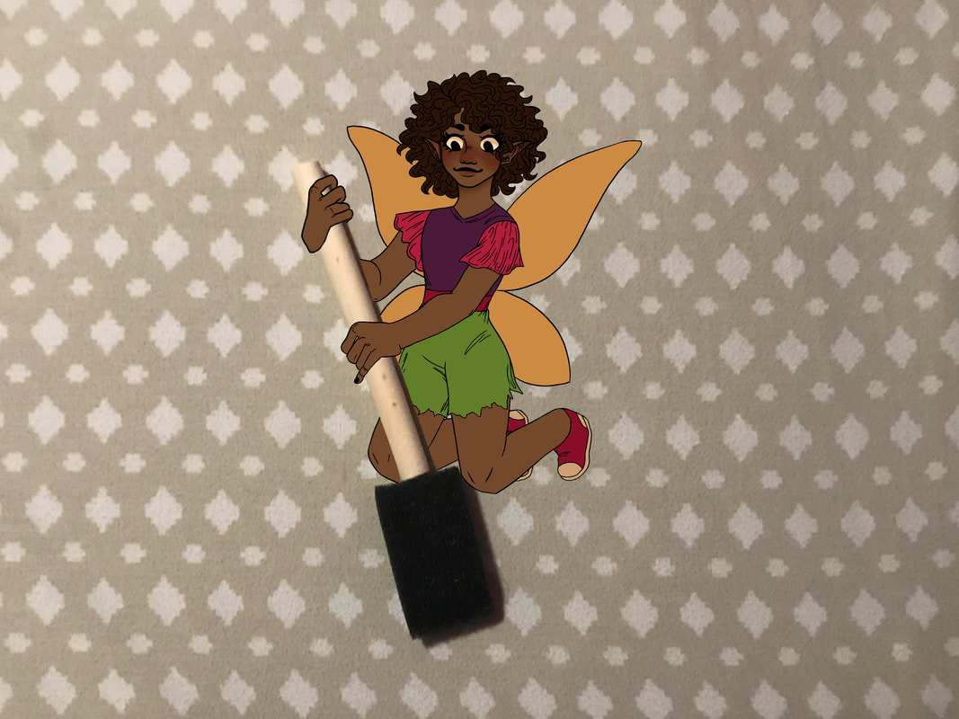
For this last small
project, we had to take a picture of some kind of object and make artwork out of it!
Unfortunately I ended up spending about two weeks trying to think of any good ideas, but for some reason I couldn’t think of a single one, so I have no other photos or sketches to upload alongside it this time. :(
I found a sponge paint brush and thought it looked like a tiny broom! So I drew a fairy girl sweeping with it! :) I think it turned out okay for the little amount of effort I put in.
In my opinion the idea’s pretty boring and not creative at all, but then again I was SUPER stuck with this project.
The brainstorming process of this project was definitely the hardest part for me, way more difficult than usual, and way more difficult than the actual drawing work!
